How we avoid surprises in architecture and construction
In architecture and construction, there are good surprises and bad surprises. Good surprises: a glorious rendering of a meticulously detailed space that is within (or below!) budget. Bad surprises: the floor not looking the way you thought it would, or not having enough lighting above a crucial work area. As much as we relish a good design meeting with a few well-timed theatrics, we never want you to experience a bad surprise when everything is built. When Keith and his construction team hand you the keys, you should be able to walk through your space and recognize every little detail: wallcovering on the correct walls, light switches where you expect them to be, walls in the right place and at the right height, those beautiful faucets you picked out (in the right finish!), and the flooring installation pattern oriented the way you intended.
Not only should you be comfortable with the result, but you should have some ownership in the process as well. We will never show you one rendering and one palette of materials and say, "This is what you should do." As much as we possibly can, we will present options that will work within your space and budget.
How do we do this? Using a combination of SketchUp, Photoshop, and Illustrator, our team will share many iterations of your project so you can explore different materials and colors to confidently make a decision. To the right, you'll see an example of this approach. We took a photograph of an existing building and treated the exterior with several different material and color options to show the client many possibilities at once. (You're seeing only three of twelve options, by the way.) A presentation like this is an effective first step to get feedback, and we can use client comments to refine the imagery and build material palettes. Through this visual communication, the client is an engaged, educated partner throughout the design process.
We use the same technique for interiors, too. Nailing the design of the spinning theatre in Steel Wheels was one of the most important parts of the project: guests spend most of their time in the theatre, so the design needed to reinforce the modern, urbane experience our client wanted to give their guests. We presented many different concepts to make the most of the space and budget, and lighting was one of the big visual considerations. You can see a sampling of our options to the right: a wood ceiling that references the wood in the lobby; strips of light that align with each tier of bikes; horizontal color-changing lights that visually connect the bikers to the screen that create a feeling of movement and speed within the space. After reviewing all of these, it was easy for our client to make a selection. (It was a hybrid of two of the 6 selections they were shown.)
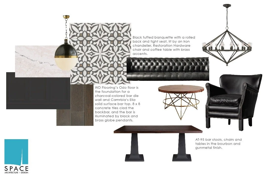
As these models develop, the interior materials will, too. In addition to material samples, we share a virtual finish board (below) that combines all of the elements of a space in a way that samples laid on a table cannot. By doing so, you can see materials, lighting, and furniture together in one image. Through modeling, a review of the drawings, and finish boards, our clients are able to see how their space is evolving, and how the finished project will look and function. No bad surprises here.


